
With good typography you can score on a level that is subconscious to most users. Hardly anyone can discern good from bad typography, but everybody can feel it.
Great typography is the secret weapon of brilliant campaigns.
It elevates your material, subtly reinforcing its message. It shapes the voice of your text. It communicates whether you care about attention to detail. And your opponents probably aren’t thinking about it.
Whether you’re making a poster, a protest banner, a website or a document with your demands, you need every advantage you can get.
There are many resources on typography for type nerds and graphic designers. But there isn’t much out there for non-specialists, who may be making their own campaign material rather than working with a professional.
I’m not a designer, but I’m interested in good design. (Even if this page with its examples looks like an explosion in a font factory.) And over the years I’ve read a lot on it.
So here’s the guide I wish I’d had a decade ago. It is 80% of what you need to give your campaign material a visual boost.
Let’s go.
1. Think about your body text first
Get the body text of your document right. Worry about headlines later.
Body text is the most common element of a document. Therefore, how the body text looks will have the most noticeable effect on the appearance of the document.
2. Choose the font for the job
Use a professional font (free or paid) for your body text. Not a system font that came pre-installed on your computer. Never use Times New Roman or Arial or Comic Sans for anything.
See the bits sticking out of the bottom of the capital “T” here? Those little flourishes are serifs. The two most common font types are serif fonts that use them, and sans-serif ones that don’t.
Serif fonts are easier to read. They make text come across as elegant and mature. They evoke seriousness, tradition and authority.
We associate sans-serif fonts with modernity and openness. They make text feel clean, minimalist, and fresh.
In print, use a serif font for your body text. On the web, use what feels right.
A recent US study found that people with conservative values prefer to read and use serif fonts. While progressives prefer sans-serif ones.
This doesn’t mean you should pick a font based on your politics, or that of your audience. It’s an indicator. Think of your communications goal, and choose the font that fits.
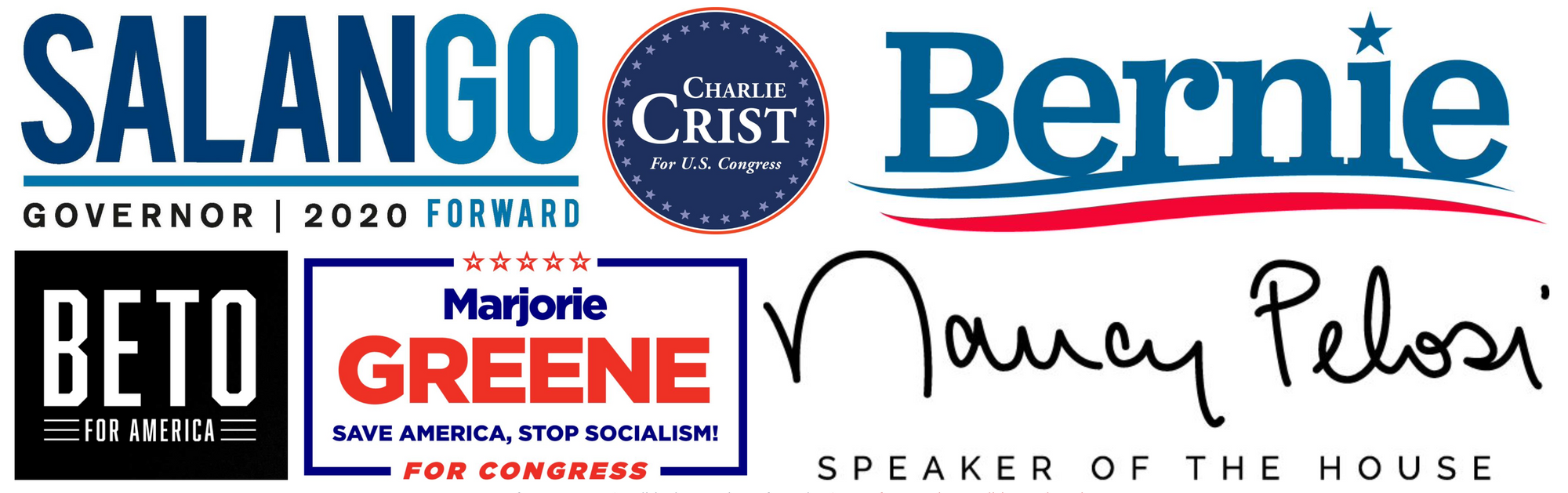
Here’s a showcase of fonts in use in activism and political material to get you started.
3. Use the right font size
For body text: 10–12 points in print, 15–25 pixels for the web. Simple enough!
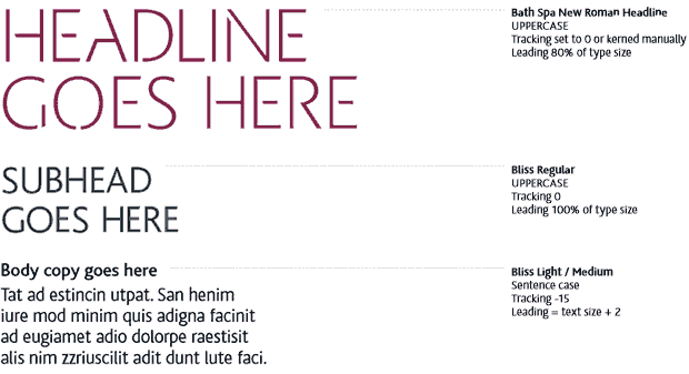
4. Give lines the correct spacing
Too little space between your lines makes it cramped and hard to read. Too much space tires your eyes as they jump between the lines.
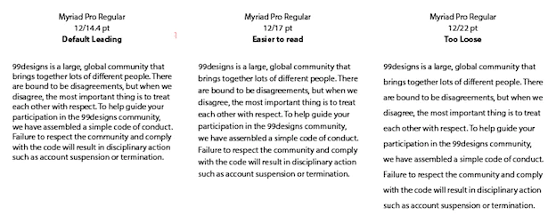
A good balance is to make your line spacing between 120–145% of the font size. Here’s how.
5. Make the line length readable
Line length is key for readability. But it’s often neglected (case in point).
Shorter lines, like those of a newspaper column, are easier to read but can break up words and result in hyphenations. Longer ones can cause you to get lost... or hurt your neck.
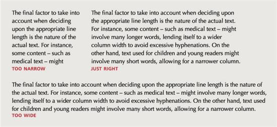
Line length is harder to get right than line spacing, but it’s worth making the effort. Set the average length of your lines, including spaces, at between 45 and 90 characters. Here’s how.
6. Use smart quotes
We use quote marks for apostrophes or quotations. Smart quotes are curly or sloped. Dumb quotes go straight up and down.
They have these names for a reason. Always use smart quotes in your writing.
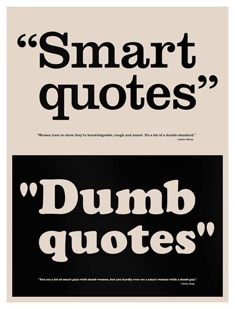
Most word processors will automatically convert dumb quotes to smart ones. If you’re struggling, here’s how to use smart quotes.
7. Use dashes and hyphens correctly
Hyphens and dashes look similar, but they are very different.
- Use a hyphen (-) to join words or parts of words.
- Use a dash to show a pause in a sentence. There are two types: the en dash (–) and the em dash (—). Pick one – and surround it by spaces.
8. Decide upfront how you’ll emphasise words
Use bold or italic in your text, not both. Use emphasis sparingly. And don’t underline.
9. Pair your font with a second that complements it
You could use one font throughout your material. But it’ll look more appealing if you pick one for your headline and one for your body text (though don’t use more than two).
There are no rules about which fonts work best together. Mixing fonts is an art that even designers use their gut for.

Look for fonts that complement each other, rather than create tension and contrast. An easy way is to use fonts designed as a pair, since they’ll share the same name. Two fonts made by the same designer are more likely to play together well. Google Fonts is a good place to start.
Here are some good pairings, and a detailed guide to combining fonts.
That’s it
You're now a better typographer. Go and take your campaign material to the next level :).
With thanks to Scott Adams.